Roblox has one of the most passionate communities in all of gaming, and everything about it tends to be picked apart and discussed. One such example would be its logo. The number of alterations made to the Roblox logo shouldn’t come as too much of a surprise given that the game is now 14 years old.
Yes, Roblox launched back in 2006, but did you know that the company was founded two years prior by David Baszucki and Erik Cassel? That’s when its first-ever logo was revealed, and that’s where we’ll begin our look back on the history of Roblox’s logo.
The Roblox logo through the ages
![]()
Roblox logo: 2004
This one’s certainly showing its age, isn’t it? Nevertheless, it’s a neat piece of history that also highlights how far Roblox has come. The varied colours appear quite playful, but it perhaps hews a little too close to some of Google’s earlier designs. This one didn’t stick for long, and it was followed by a radical new look.
![]()
Roblox logo: 2005
The logo’s first major redesign was also one of its wildest. Just look at that striking red outline and the little accent over the ‘o’. Sure, it’s painfully mid-2000s, but it’s so distinct and retro by today’s standards that you can’t help but appreciate it.
![]()
Roblox logo: 2006
This one was another huge departure from what came before. It appears a lot more kid-friendly and fun than the previous logo, perhaps in an effort to engage younger players.
![]()
Roblox logo: 2015
This was a very iterative redesign, refining the previous concept without changing things too much. It’s generally just a whole lot nicer to look at than the gen three design.
![]()
Roblox logo: 2017
The fifth major Roblox logo arrived in early 2017 and offered the cleanest redesign to date. With nice, blocky letters, red colouring, and a tilted ‘o’, it’s a very modern logo with a lot to appreciate. In an official company update, David Baszucki called it “a testament to our cross-platform vision, as well as our commitment to helping power the imagination of kids of all ages around the world.”
![]()
Roblox logo: 2020
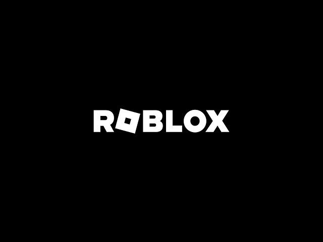
The most recent Roblox logo is another iterative update. It’s most often white, though there are also black and even graphite variants. The tilted ‘o’ in Roblox is still used as the game’s key icon.
![]()
Roblox logo: 2022
The latest refresh of the Roblox logo is only slight, with the second ‘O’ no longer a square, and the font looking a little slimmer and slicker.
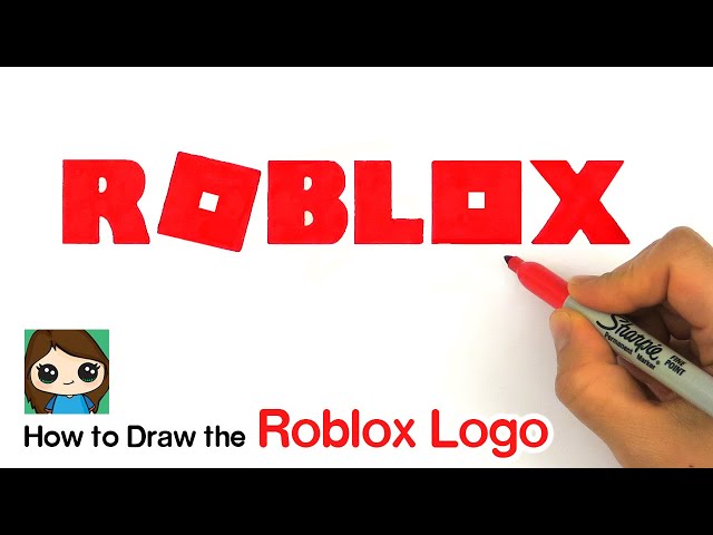
How to draw the Roblox logo
Finally, here’s a handy video tutorial on how to draw the modern Roblox logo. The red colouring is now slightly out of date, but that’s an easy fix when you go to create your own.
You can grab Roblox now from over on the App Store and Google Play. And, while you’re here, you should also check out our list of the best Roblox games, Roblox slender guide, and tips on how to earn Roblox free Robux.